Mitchell Lane House
Project Description
MITCHELL LANE HOUSE.
Bridgehampton, NY.
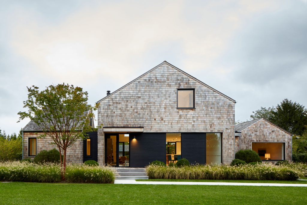
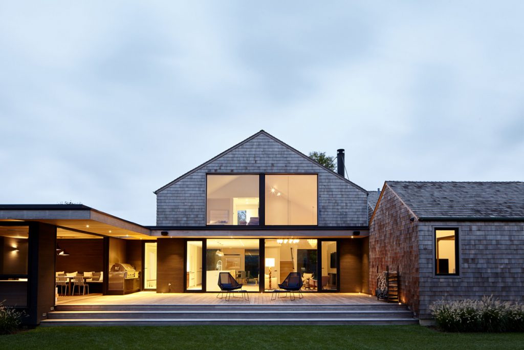
In its previous life, this home was a spatially challenged ‘80s specimen known as a “contemporary.” But, while outdated, the house — an arrangement of three barn-like structures — had great bones and flow. So, instead of razing it, we entirely re-imagined and re-created it to appear as though it was built and designed from scratch.
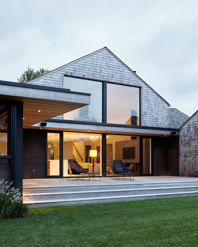
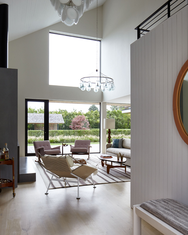
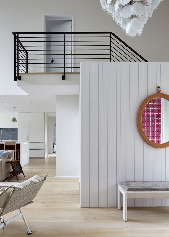
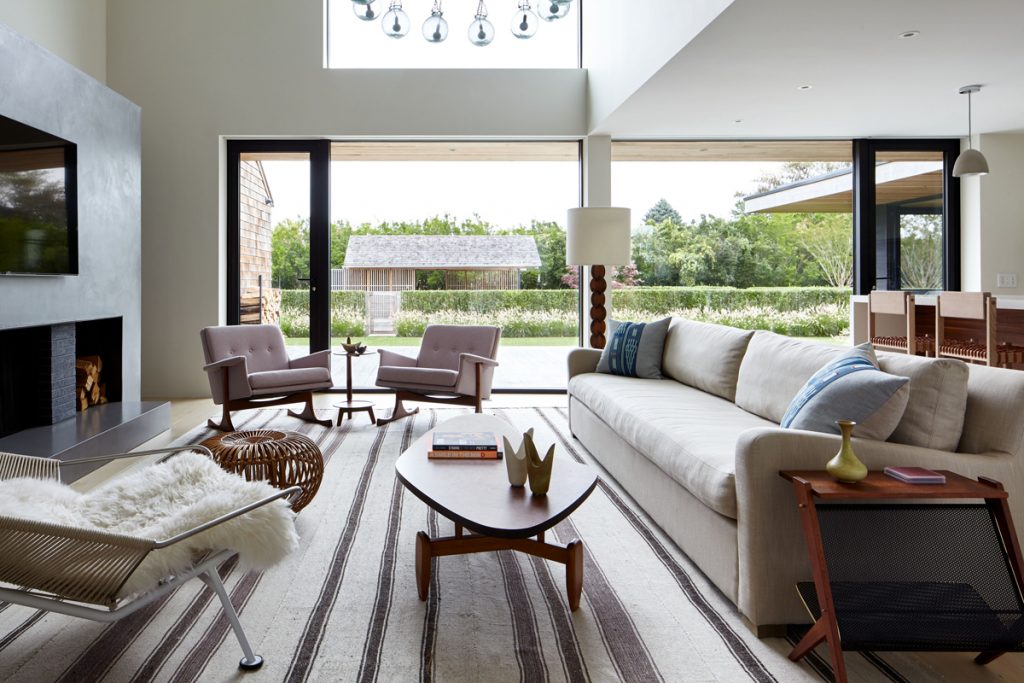
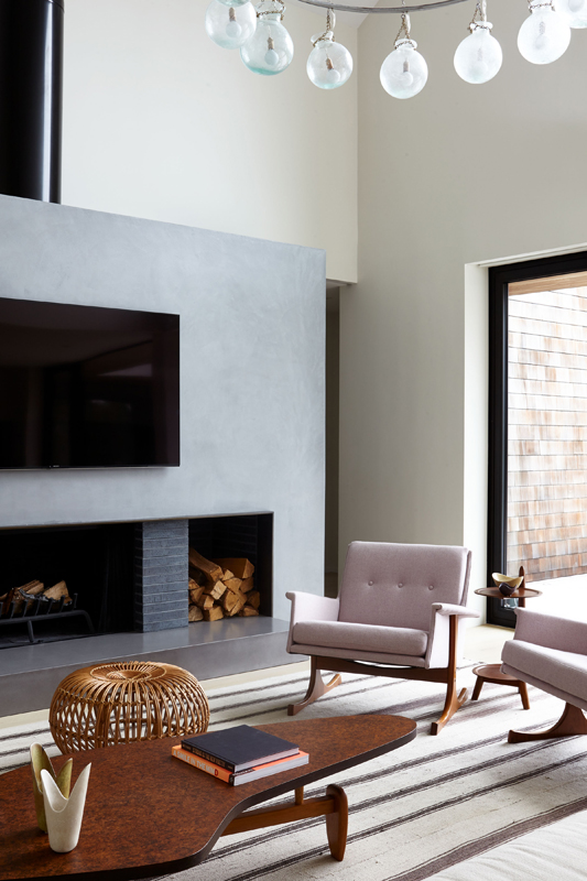
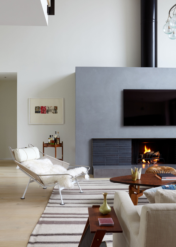
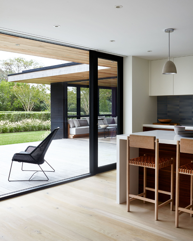
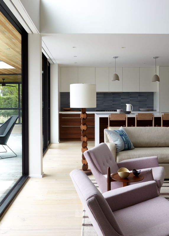
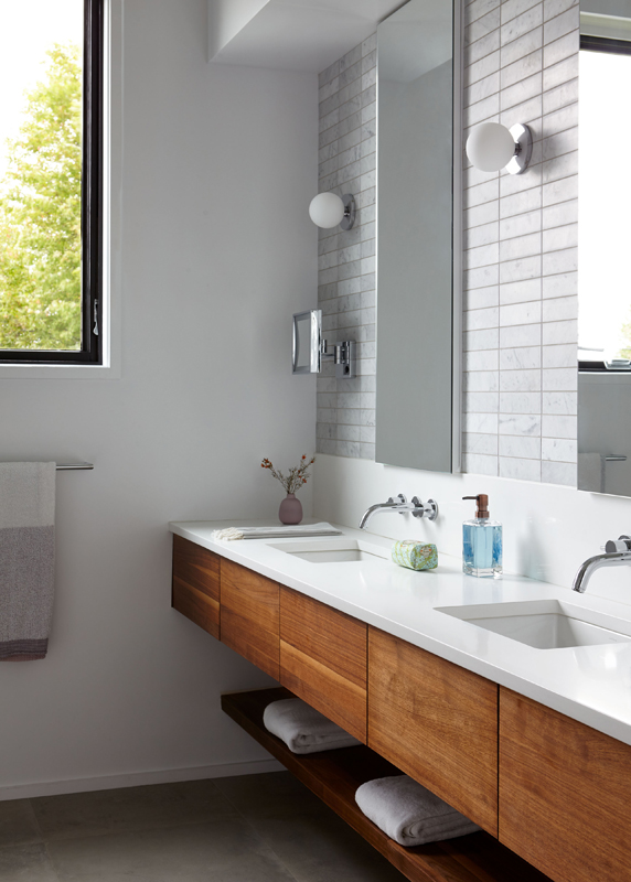
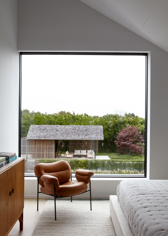
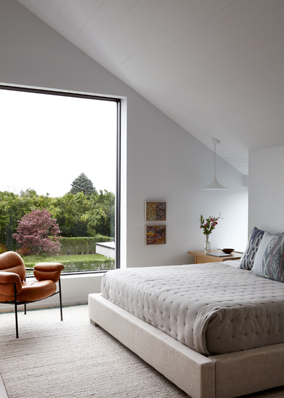
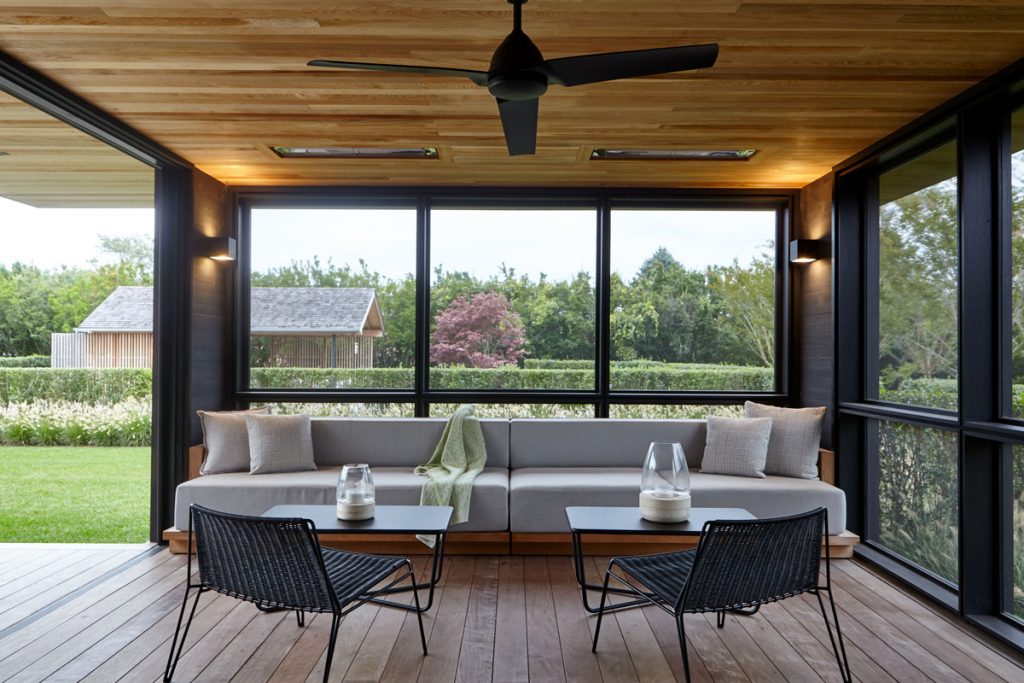
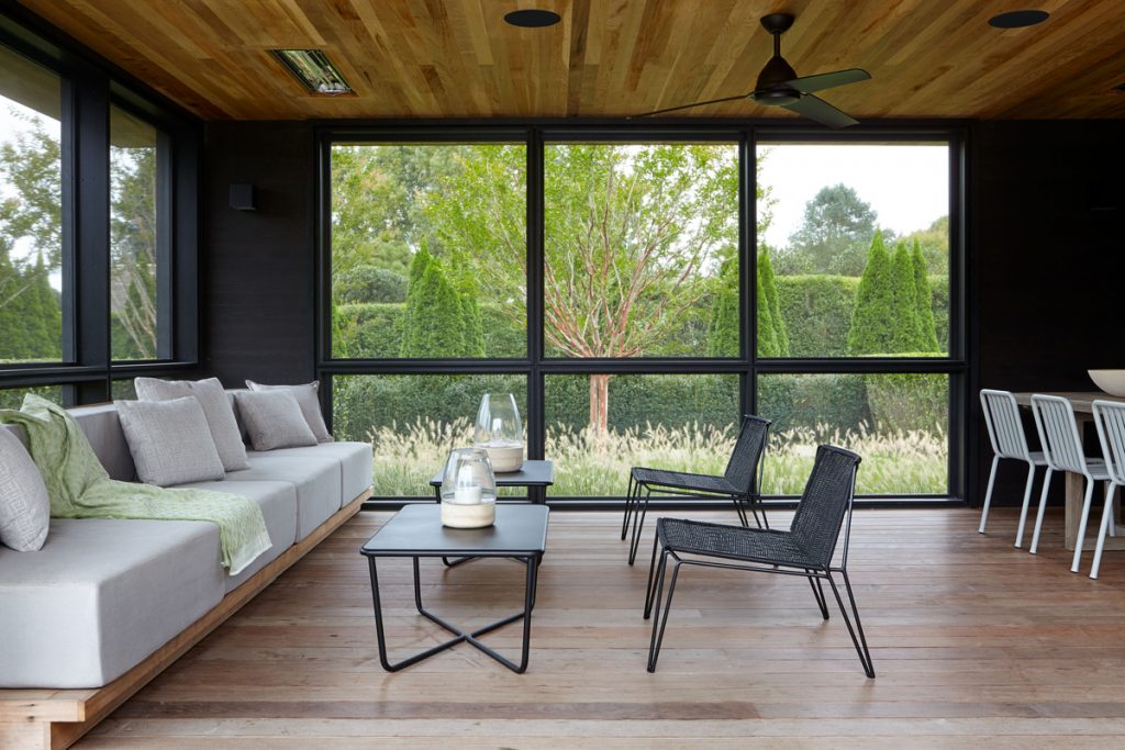
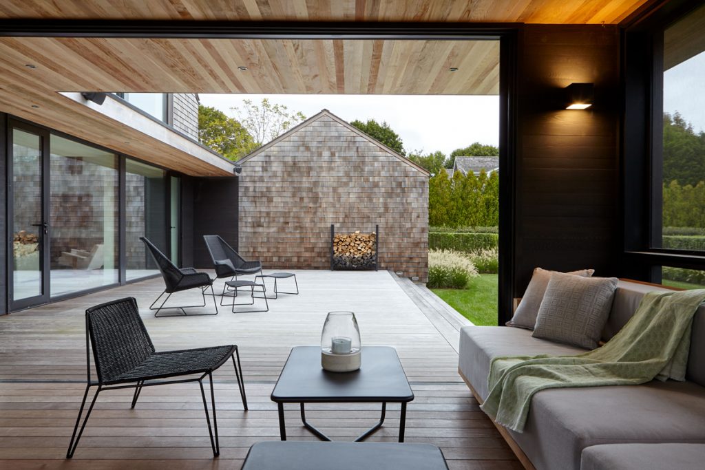
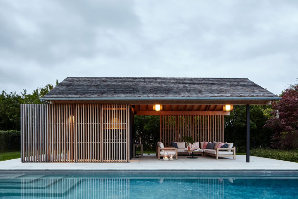
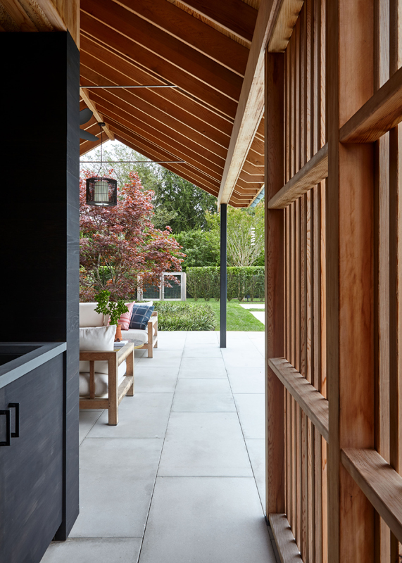
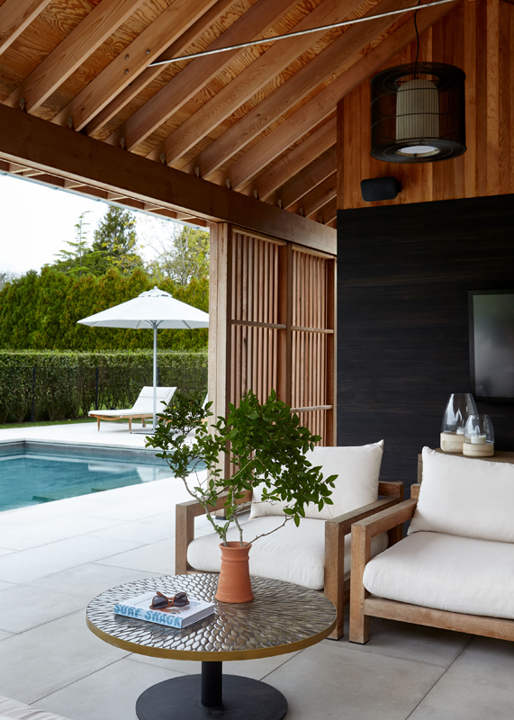
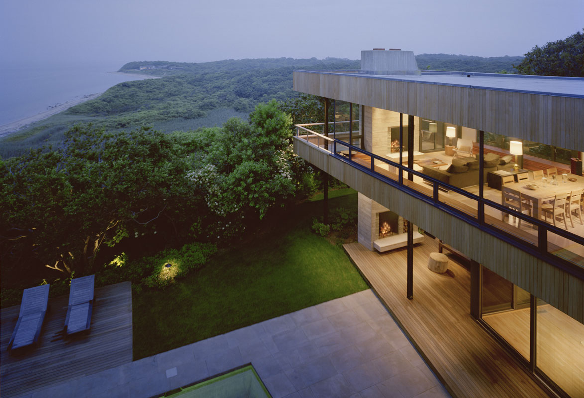
In the main house, we rethought every detail. Upstairs, the master bedroom and master bathroom were flipped, with the bedroom moved from the front of the house to the back for privacy. Downstairs, we opened up the space significantly, removing an odd curved balcony to create a more spacious double-height living room, also facing the backyard (which includes a new deck with screened porch, and an all-new pool and small poolhouse located in a separate, gated area).
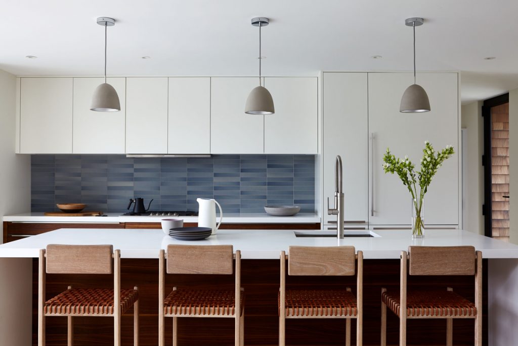
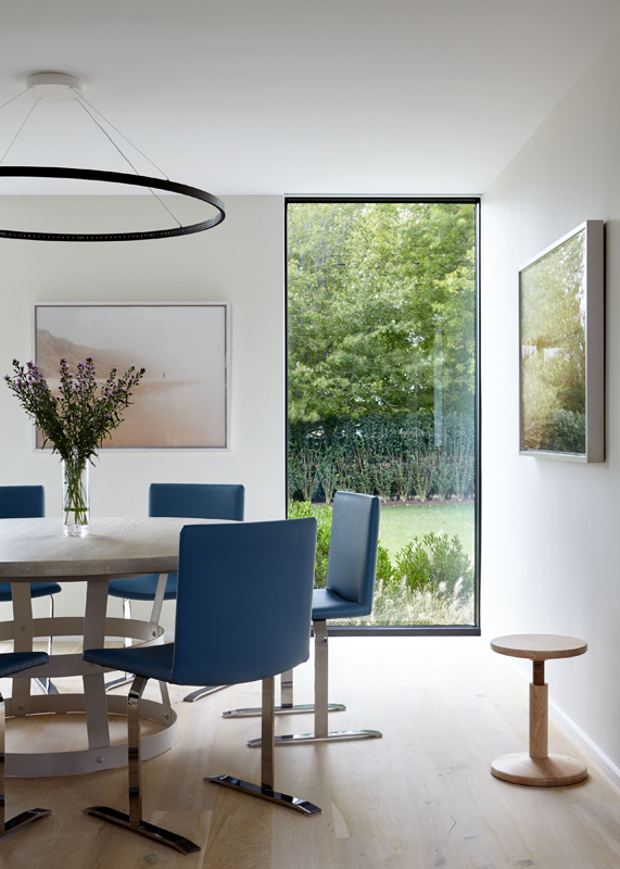
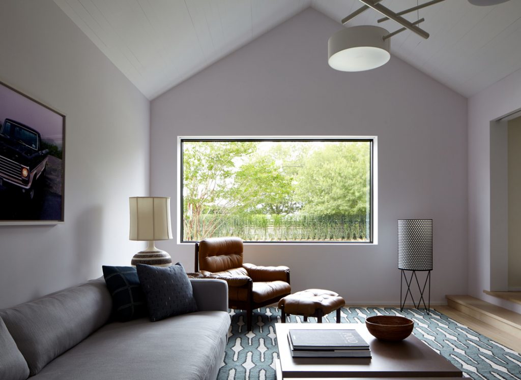
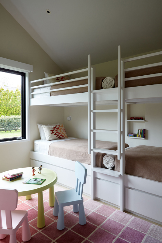
The overall effect is one of seamless indoor-outdoor living that’s great for entertaining — especially in summer — but also kid-friendly (it houses a family of four). Inside, bleached white oak floors and white-painted wood planks lend a breezy, beachy vibe, accented with solid walnut and dark concrete and bronze.
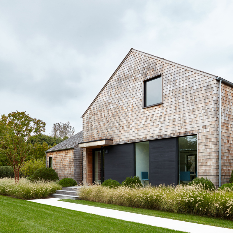
The windows — previously an awkward composition of uncoordinated shapes — were reenvisioned to create a look that’s modern and open but not overexposed. In the back of the house, an expansive quadrant of large square windows offers a clean, welcoming aesthetic from the outside and great views from the inside. But in the front (facing the road) the use of windows was pared down for privacy.
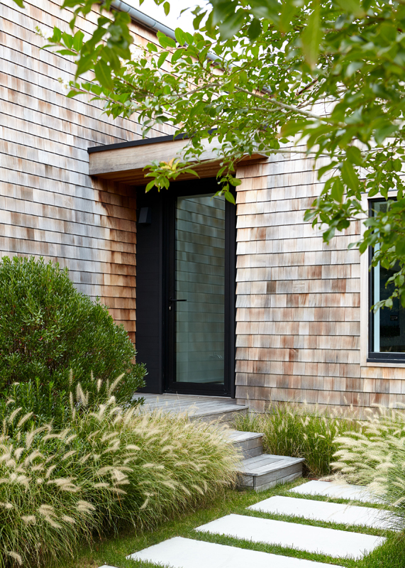
On the outside, we visually emphasized the simple, iconic barn-like shapes of the three main volumes by using black stained cedar on the “links” between them. The black contrasts and falls into shadow next to the natural cedar, which will weather to a natural silver over time. A swath of the same black cedar announces the entrance as a sleek, modern “welcome portal,” with a sheltering roof over the glass front door.
Additionally, inside the connector between the main house and family room, we reconfigured the layout to include a side entrance to a new mudroom that connects to the rear of the house as well — increasing the practicality and maximizing the space in a home that’s now truly modern, rather than just contemporary in style.
PRINCIPAL-IN-CHARGE: Robert Young, AIA; PROJECT ARCHITECTS: Marina Tomic and Greg Tietjen; INTERIOR DESIGN: Damon Liss Design; LANDSCAPE ARCHITECT: LaGuardia Design Group; STRUCTURAL ENGINEER: S.L. Maresca & Associates; GENERAL CONTRACTOR: Artisan Construction Associates, Inc; LANDSCAPE CONTRACTOR: Summerhill Landscapes, Inc; PHOTOGRAPHY: Joshua McHugh (c).
